pacman::p_load(lubridate, ggthemes, reactable,
reactablefmtr, gt, gtExtras, tidyverse,svglite)Hands-on Exercise 10 - Information Dashboard Design: R methods
Learning Objectives:
- create bullet chart by using ggplot2,
- create sparklines by using ggplot2 ,
- build industry standard dashboard by using R Shiny.
Getting Started
Installing and loading the required libraries
The following R packages will be used:
tidyverse provides a collection of functions for performing data science task such as importing, tidying, wrangling data and visualising data. It is not a single package but a collection of modern R packages including but not limited to readr, tidyr, dplyr, ggplot, tibble, stringr, forcats and purrr.
lubridate provides functions to work with dates and times more efficiently.
ggthemes is an extension of ggplot2. It provides additional themes beyond the basic themes of ggplot2.
gtExtras provides some additional helper functions to assist in creating beautiful tables with gt, an R package specially designed for anyone to make wonderful-looking tables using the R programming language.
reactable provides functions to create interactive data tables for R, based on the React Table library and made with reactR.
reactablefmtr provides various features to streamline and enhance the styling of interactive reactable tables with easy-to-use and highly-customizable functions and themes.
svglite
Code chunk below will be used to check if these packages have been installed and also will load them into the working R environment.
Importing Microsoft Access database
The Data
A personal database in Microsoft Access mdb format called Coffee Chain will be used.
Importing Data
odbcConnectAccess() of RODBC package is used used to import a database query table into R.
If an issue arises, change the R environment from 64bit to 32 bit:
From R Studio > Tools > Global Options > General > Basic > R session > R version: Change > Use your machine’s default version of R (32-bit).
Note: Since R 4.2.0, 32-bit builds are no longer provided.
library(RODBC)
con <- odbcConnectAccess2007('data/Coffee Chain.mdb')
coffeechain <- sqlFetch(con, 'CoffeeChain Query')
write_rds(coffeechain, "data/CoffeeChain.rds")
odbcClose(con)
Preparing the Data
The code chunk below is used to import CoffeeChain.rds into R.
coffeechain <- read_rds("data/rds/CoffeeChain.rds")
Note
Note: If coffeechain is already available in R, above step is optional
The code chunk below is used to aggregate Sales and Budgeted Sales at the Product level.
product <- coffeechain %>%
  group_by(`Product`) %>%
  summarise(`target` = sum(`Budget Sales`),
            `current` = sum(`Sales`)) %>%
  ungroup()
Bullet chart in ggplot2
The code chunk below is used to plot the bullet charts using ggplot2 functions.
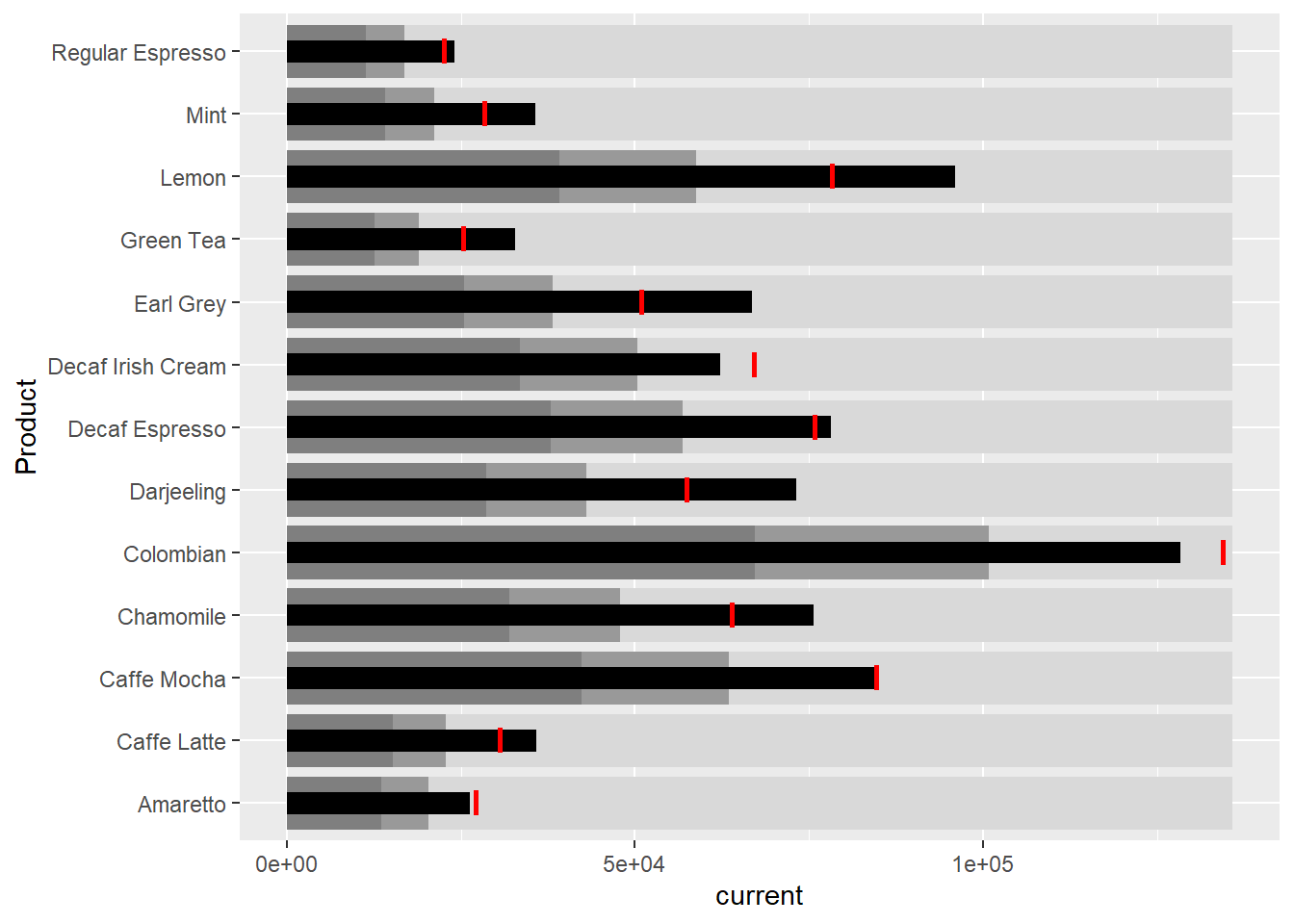
ggplot(product, aes(Product, current)) +
  geom_col(aes(Product, max(target) * 1.01),
           fill="grey85", width=0.85) +
  geom_col(aes(Product, target * 0.75),
           fill="grey60", width=0.85) +
  geom_col(aes(Product, target * 0.5),
           fill="grey50", width=0.85) +
  geom_col(aes(Product, current),
           width=0.35,
           fill = "black") +
  geom_errorbar(aes(y = target,
                    x = Product,
                    ymin = target,
                    ymax= target),
                width = .4,
                colour = "red",
                size = 1) +
  coord_flip()
Plotting sparklines using ggplot2
Preparing the data
sales_report <- coffeechain %>%
  filter(Date >= "2013-01-01") %>%
  mutate(Month = month(Date)) %>%
  group_by(Month, Product) %>%
  summarise(Sales = sum(Sales)) %>%
  ungroup() %>%
  select(Month, Product, Sales)
Compute the minimum, maximum and end of the monthly sales
mins <- group_by(sales_report, Product) %>%
  slice(which.min(Sales))
maxs <- group_by(sales_report, Product) %>%
  slice(which.max(Sales))
ends <- group_by(sales_report, Product) %>%
  filter(Month == max(Month))
Compute the 25 and 75 quantiles
quarts <- sales_report %>%
  group_by(Product) %>%
  summarise(quart1 = quantile(Sales,
                              0.25),
            quart2 = quantile(Sales,
                              0.75)) %>%
  right_join(sales_report)
sparklines in ggplot2
ggplot(sales_report, aes(x=Month, y=Sales)) +
  facet_grid(Product ~ ., scales = "free_y") +
  geom_ribbon(data = quarts, aes(ymin = quart1, max = quart2),
              fill = 'grey90') +
  geom_line(size=0.3) +
  geom_point(data = mins, col = 'red') +
  geom_point(data = maxs, col = 'blue') +
  geom_text(data = mins, aes(label = Sales), vjust = -1) +
  geom_text(data = maxs, aes(label = Sales), vjust = 2.5) +
  geom_text(data = ends, aes(label = Sales), hjust = 0, nudge_x = 0.5) +
  geom_text(data = ends, aes(label = Product), hjust = 0, nudge_x = 1.0) +
  expand_limits(x = max(sales_report$Month) +
                  (0.25 * (max(sales_report$Month) - min(sales_report$Month)))) +
  scale_x_continuous(breaks = seq(1, 12, 1)) +
  scale_y_continuous(expand = c(0.1, 0)) +
  theme_tufte(base_size = 3, base_family = "Helvetica") +
  theme(axis.title=element_blank(), axis.text.y = element_blank(),
        axis.ticks = element_blank(), strip.text = element_blank())
Static Information Dashboard Design: gt and gtExtras methods
Create static information dashboard by using gt and gtExtras packages.
Plotting a simple bullet chart
| Product | current |
|---|---|
| Amaretto | |
| Caffe Latte | |
| Caffe Mocha | |
| Chamomile | |
| Colombian | |
| Darjeeling | |
| Decaf Espresso | |
| Decaf Irish Cream | |
| Earl Grey | |
| Green Tea | |
| Lemon | |
| Mint | |
| Regular Espresso |
product %>%
  gt::gt() %>%
  gt_plt_bullet(column = current,
              target = target,
              width = 60,
              palette = c("lightblue",
                          "black")) %>%
  gt_theme_538()
sparklines: gtExtras method
Data Preparation
report <- coffeechain %>%
  mutate(Year = year(Date)) %>%
  filter(Year == "2013") %>%
  mutate (Month = month(Date,
                        label = TRUE,
                        abbr = TRUE)) %>%
  group_by(Product, Month) %>%
  summarise(Sales = sum(Sales)) %>%
  ungroup()
Important
A requirement of gtExtras function: data.frame must be passed with list columns. Thus, the report data.frame must be converted into list columns.
Convert Data Frame into List Columns
report %>%
  group_by(Product) %>%
  summarize('Monthly Sales' = list(Sales),
            .groups = "drop")
# A tibble: 13 × 2
Product `Monthly Sales`
<chr> <list>
1 Amaretto <dbl [12]>
2 Caffe Latte <dbl [12]>
3 Caffe Mocha <dbl [12]>
4 Chamomile <dbl [12]>
5 Colombian <dbl [12]>
6 Darjeeling <dbl [12]>
7 Decaf Espresso <dbl [12]>
8 Decaf Irish Cream <dbl [12]>
9 Earl Grey <dbl [12]>
10 Green Tea <dbl [12]>
11 Lemon <dbl [12]>
12 Mint <dbl [12]>
13 Regular Espresso <dbl [12]> Plotting Coffechain Sales report
report %>%
  group_by(Product) %>%
  summarize('Monthly Sales' = list(Sales),
            .groups = "drop") %>%
   gt() %>%
   gt_plt_sparkline('Monthly Sales',
same_limit = FALSE)| Product | Monthly Sales |
|---|---|
| Amaretto | |
| Caffe Latte | |
| Caffe Mocha | |
| Chamomile | |
| Colombian | |
| Darjeeling | |
| Decaf Espresso | |
| Decaf Irish Cream | |
| Earl Grey | |
| Green Tea | |
| Lemon | |
| Mint | |
| Regular Espresso |
Adding statistics
report %>%
  group_by(Product) %>%
  summarise("Min" = min(Sales, na.rm = T),
            "Max" = max(Sales, na.rm = T),
            "Average" = mean(Sales, na.rm = T)
            ) %>%
  gt() %>%
  fmt_number(columns = 4,
decimals = 2)| Product | Min | Max | Average |
|---|---|---|---|
| Amaretto | 1016 | 1210 | 1,119.00 |
| Caffe Latte | 1398 | 1653 | 1,528.33 |
| Caffe Mocha | 3322 | 3828 | 3,613.92 |
| Chamomile | 2967 | 3395 | 3,217.42 |
| Colombian | 5132 | 5961 | 5,457.25 |
| Darjeeling | 2926 | 3281 | 3,112.67 |
| Decaf Espresso | 3181 | 3493 | 3,326.83 |
| Decaf Irish Cream | 2463 | 2901 | 2,648.25 |
| Earl Grey | 2730 | 3005 | 2,841.83 |
| Green Tea | 1339 | 1476 | 1,398.75 |
| Lemon | 3851 | 4418 | 4,080.83 |
| Mint | 1388 | 1669 | 1,519.17 |
| Regular Espresso | 890 | 1218 | 1,023.42 |
Combining the data.frame
Monthly Sales
spark <- report %>%
  group_by(Product) %>%
  summarize('Monthly Sales' = list(Sales),
            .groups = "drop")
Sales statistics
sales <- report %>%
  group_by(Product) %>%
  summarise("Min" = min(Sales, na.rm = T),
            "Max" = max(Sales, na.rm = T),
            "Average" = mean(Sales, na.rm = T)
            )
Combine all
sales_data = left_join(sales, spark)Plotting the updated data.table
| Product | Min | Max | Average | Monthly Sales |
|---|---|---|---|---|
| Amaretto | 1016 | 1210 | 1119.000 | |
| Caffe Latte | 1398 | 1653 | 1528.333 | |
| Caffe Mocha | 3322 | 3828 | 3613.917 | |
| Chamomile | 2967 | 3395 | 3217.417 | |
| Colombian | 5132 | 5961 | 5457.250 | |
| Darjeeling | 2926 | 3281 | 3112.667 | |
| Decaf Espresso | 3181 | 3493 | 3326.833 | |
| Decaf Irish Cream | 2463 | 2901 | 2648.250 | |
| Earl Grey | 2730 | 3005 | 2841.833 | |
| Green Tea | 1339 | 1476 | 1398.750 | |
| Lemon | 3851 | 4418 | 4080.833 | |
| Mint | 1388 | 1669 | 1519.167 | |
| Regular Espresso | 890 | 1218 | 1023.417 |
sales_data %>%
  gt() %>%
  gt_plt_sparkline('Monthly Sales',
                   same_limit = FALSE)
Combining bullet chart and sparklines
Bullet Chart
bullet <- coffeechain %>%
  filter(Date >= "2013-01-01") %>%
  group_by(`Product`) %>%
  summarise(`Target` = sum(`Budget Sales`),
            `Actual` = sum(`Sales`)) %>%
  ungroup()
Join data
sales_data = sales_data %>%
  left_join(bullet)
Plot Data
| Product | Min | Max | Average | Monthly Sales | Actual |
|---|---|---|---|---|---|
| Amaretto | 1016 | 1210 | 1119.000 | ||
| Caffe Latte | 1398 | 1653 | 1528.333 | ||
| Caffe Mocha | 3322 | 3828 | 3613.917 | ||
| Chamomile | 2967 | 3395 | 3217.417 | ||
| Colombian | 5132 | 5961 | 5457.250 | ||
| Darjeeling | 2926 | 3281 | 3112.667 | ||
| Decaf Espresso | 3181 | 3493 | 3326.833 | ||
| Decaf Irish Cream | 2463 | 2901 | 2648.250 | ||
| Earl Grey | 2730 | 3005 | 2841.833 | ||
| Green Tea | 1339 | 1476 | 1398.750 | ||
| Lemon | 3851 | 4418 | 4080.833 | ||
| Mint | 1388 | 1669 | 1519.167 | ||
| Regular Espresso | 890 | 1218 | 1023.417 |
sales_data %>%
  gt() %>%
  gt_plt_sparkline('Monthly Sales') %>%
  gt_plt_bullet(column = Actual,
                target = Target,
                width = 28,
                palette = c("lightblue",
                          "black")) %>%
  gt_theme_538()
Interactive Information Dashboard Design: reactable and reactablefmtr methods
Create interactive information dashboard by using reactable and reactablefmtr packages.
In order to build an interactive sparklines, dataui R package needs to be installed.
remotes::install_github("timelyportfolio/dataui")rlang (1.1.3 -> 1.1.4 ) [CRAN]
fastmap (1.1.1 -> 1.2.0 ) [CRAN]
digest (0.6.35 -> 0.6.36) [CRAN]
cli (3.6.2 -> 3.6.3 ) [CRAN]
highr (0.10 -> 0.11 ) [CRAN]
cachem (1.0.8 -> 1.1.0 ) [CRAN]
xfun (0.43 -> 0.45 ) [CRAN]
tinytex (0.50 -> 0.51 ) [CRAN]
knitr (1.46 -> 1.47 ) [CRAN]
evaluate (0.23 -> 0.24.0) [CRAN]
rmarkdown (2.26 -> 2.27 ) [CRAN]
reactR (0.5.0 -> 0.6.0 ) [CRAN]
There is a binary version available but the source version is later:
binary source needs_compilation
reactR 0.5.0 0.6.0 FALSE
package 'rlang' successfully unpacked and MD5 sums checked
package 'fastmap' successfully unpacked and MD5 sums checked
package 'digest' successfully unpacked and MD5 sums checked
package 'cli' successfully unpacked and MD5 sums checked
package 'highr' successfully unpacked and MD5 sums checked
package 'cachem' successfully unpacked and MD5 sums checked
package 'xfun' successfully unpacked and MD5 sums checked
package 'tinytex' successfully unpacked and MD5 sums checked
package 'knitr' successfully unpacked and MD5 sums checked
package 'evaluate' successfully unpacked and MD5 sums checked
package 'rmarkdown' successfully unpacked and MD5 sums checked
The downloaded binary packages are in
C:\Users\idrin\AppData\Local\Temp\RtmpkfsYnK\downloaded_packages
── R CMD build ─────────────────────────────────────────────────────────────────
* checking for file 'C:\Users\idrin\AppData\Local\Temp\RtmpkfsYnK\remotes75086b2f5d0d\timelyportfolio-dataui-39583c6/DESCRIPTION' ... OK
* preparing 'dataui':
* checking DESCRIPTION meta-information ... OK
* checking for LF line-endings in source and make files and shell scripts
* checking for empty or unneeded directories
Omitted 'LazyData' from DESCRIPTION
* building 'dataui_0.0.1.tar.gz'
Load the package onto R environment
library(dataui)Plotting interactive sparklines
Prepare the list field
report <- report %>%
  group_by(Product) %>%
  summarize(`Monthly Sales` = list(Sales))
Next, react_sparkline will be used to plot the sparklines
reactable(
  report,
  columns = list(
    Product = colDef(maxWidth = 200),
    `Monthly Sales` = colDef(
      cell = react_sparkline(report)
    )
  )
)
Changing the pagesize
By default the pagesize is 10. Argument defaultPageSize is used to change the default setting.
reactable(
  report,
  defaultPageSize = 13,
  columns = list(
    Product = colDef(maxWidth = 200),
    `Monthly Sales` = colDef(
      cell = react_sparkline(report)
    )
  )
)
Adding points and labels
highlight_points argument is used to show the minimum and maximum values points and label argument is used to label first and last values.
reactable(
  report,
  defaultPageSize = 13,
  columns = list(
    Product = colDef(maxWidth = 200),
    `Monthly Sales` = colDef(
      cell = react_sparkline(
        report,
        highlight_points = highlight_points(
          min = "red", max = "blue"),
        labels = c("first", "last")
        )
    )
  )
)
Adding reference line
statline argument is used to show the mean line.
reactable(
  report,
  defaultPageSize = 13,
  columns = list(
    Product = colDef(maxWidth = 200),
    `Monthly Sales` = colDef(
      cell = react_sparkline(
        report,
        highlight_points = highlight_points(
          min = "red", max = "blue"),
        statline = "mean"
        )
    )
  )
)
Adding bandline
bandline can be added by using the bandline argument.
reactable(
  report,
  defaultPageSize = 13,
  columns = list(
    Product = colDef(maxWidth = 200),
    `Monthly Sales` = colDef(
      cell = react_sparkline(
        report,
        highlight_points = highlight_points(
          min = "red", max = "blue"),
        line_width = 1,
        bandline = "innerquartiles",
        bandline_color = "green"
        )
    )
  )
)
Changing from sparkline to sparkbar
Instead of displaying the values as sparklines, we can display them as sparkbars.
reactable(
  report,
  defaultPageSize = 13,
  columns = list(
    Product = colDef(maxWidth = 200),
    `Monthly Sales` = colDef(
      cell = react_sparkbar(
        report,
        highlight_bars = highlight_bars(
          min = "red", max = "blue"),
        bandline = "innerquartiles",
        statline = "mean")
    )
  )
)