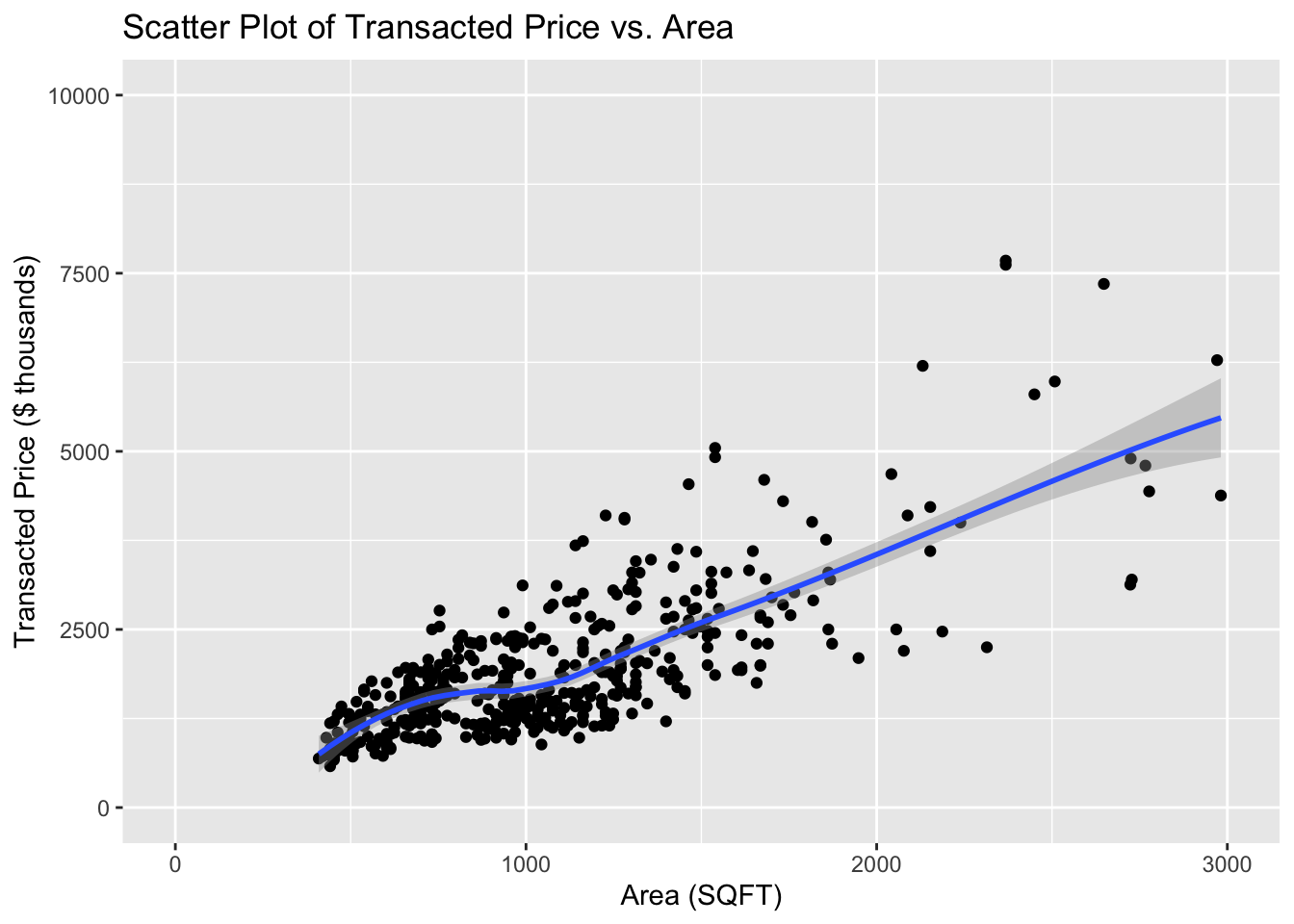
The clustering of data around certain areas makes it a bit difficult to discern individual data points or trends in those denser regions
The inclusion of a trend line helps illustrate the relationship between area and price
The trend line without filters for property type or sale type, might be misleading. Different types of properties and sales often have different pricing dynamics. A general trend across all types might obscure specific trends that are more actionable or relevant.
The scales on both axes seem appropriate, showing a good spread of data points across the chart
there may be some outlier points or less dense areas that are not fully addressed by the trend analysis
Pros
Cons
The layout is simple and effective, with no unnecessary elements to distract from the data
Utilizing a color scale for data points based on another variable (e.g., type of sale) could enhance the visual richness of the plot.
The use of a single color for data points and a contrasting blue for the trend line is effective
Varying the point size based on another variable could provide additional layers of information at a glance
The gridlines are subtle and do not overpower the data points, which helps in maintaining focus on the data itself.
Lack use of interactive points
Suggested Improvements
Step 1: Load library and data
Code
# Load library for data manipulationpacman::p_load(ggplot2,plotly,dplyr,tidyverse,ggrepel)# Load in Datasetwd("C:/kekekay/ISSS608-VAA/takehome/data")full_data <-list.files(pattern ="*.csv",full.names=T) %>%lapply(read_csv) %>%bind_rows()
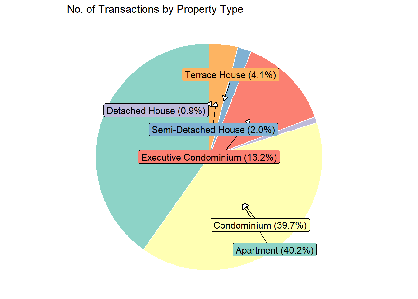
Step 2: Aggregate Data: Count transactions per property type
Step 3: Use ggplot2 to create a pie chart representing the number of transactions for each property type
Code
colors <-c("#8dd3c7", "#ffffb3", "#bebada", "#fb8072", "#80b1d3", "#fdb462", "#b3de69")ggplot(transaction_counts, aes(x ="", y = Transactions, fill =`Property Type`)) +geom_bar(stat ="identity", width =4, color ="white") +coord_polar(theta ="y") +scale_fill_manual(values = colors) +geom_label_repel(aes(label =sprintf("%s (%.1f%%)", `Property Type`, Percentage)),nudge_x =2*cos(seq(0, 2* pi, length.out =nrow(transaction_counts) +1)[-nrow(transaction_counts) -1]), # Adjust for radial placementnudge_y =1*sin(seq(0, 2* pi, length.out =nrow(transaction_counts) +1)[-nrow(transaction_counts) -1]), # Adjust for radial placementarrow =arrow(length =unit(0.02, "npc"), type ="closed", ends ="last"),size =4, # Adjust font size for readabilitycolor ="black" ) +labs(title ="No. of Transactions by Property Type") +theme_void() +theme(legend.position ="none")
Since condominiums and apartments account for the highest number of transactions, we will conduct a detailed market analysis of their unit prices per square foot.
# Filter data for only Condominiumscondo_data <- full_data %>%filter(`Property Type`=="Condominium")# Sampling datasampled_data <- condo_data[sample(nrow(condo_data), 500), ]sampled_data$`Transacted Price ($)`<- sampled_data$`Transacted Price ($)`/1000# Calculate Price per Sq ftsampled_data$`Price per Sq ft`<- sampled_data$`Transacted Price ($)`/ sampled_data$`Area (SQFT)`# Create the ggplotP3 <-ggplot(data = sampled_data, aes(x =`Area (SQFT)`, y =`Transacted Price ($)`, size =`Price per Sq ft`, color =`Type of Sale`, text =paste("Price: ", `Transacted Price ($)`, "k<br>Area: ", `Area (SQFT)`, "sqft<br>Type of Sale: ", `Type of Sale`, "<br>Price per Sq ft: $", round(`Price per Sq ft`, 2), "/sqft"))) +geom_point(alpha =0.3) +# Increased transparencygeom_smooth(method ="lm", se =FALSE) +scale_size_area(max_size =5) +# Area scaled size for proportional visibilityscale_x_continuous(limits =c(200, 4000), breaks =seq(400, 4000, by =200)) +scale_y_continuous(limits =c(0, 10000)) +labs(x ="Condominium Size (sq ft)", y ="Sale Price (in $000)",title ="Market Analysis: Unit Price(Sqft) for Condominiums") +guides(size =guide_legend(title ="Price per Sq ft")) +theme_minimal() +theme(legend.position ="bottom",panel.grid.major =element_line(color ="gray", size =0.5),panel.grid.minor =element_line(color ="lightgray", size =0.25),axis.text.x =element_text(angle =45, hjust =1))# Convert to interactive plotP3_interactive <-ggplotly(P3, tooltip ="text")# Print the interactive plotP3_interactive
The plot legend indicates that resale properties generally have the lowest unit prices, as illustrated by the smaller size of the points. Resale transactions, which predominantly occur within the 400-1800 sq ft range, do not necessarily become more expensive with increased size, highlighting a non-linear pricing structure for larger properties.
Conversely, new sales show a clearer trend where larger units command higher prices per square foot, though the maximum size for new condominiums caps at 2400 sq ft, smaller compared to resales which extend up to 3600 sq ft.
Subsales display relatively stable pricing, ranging from $1.62 to $2.25 per sq ft, which suggests a less volatile segment within the condominium market.
Code
# Filter data for only apartmentsap_data <- full_data %>%filter(`Property Type`=="Apartment")# Sampling datasampled_data1 <- ap_data[sample(nrow(ap_data), 500), ]sampled_data1$`Transacted Price ($)`<- sampled_data1$`Transacted Price ($)`/1000# Calculate Price per Sq ftsampled_data1$`Price per Sq ft`<- sampled_data1$`Transacted Price ($)`/ sampled_data1$`Area (SQFT)`# Create the ggplotp2 <-ggplot(data = sampled_data1, aes(x =`Area (SQFT)`, y =`Transacted Price ($)`, size =`Price per Sq ft`, color =`Type of Sale`, text =paste("Price: ", `Transacted Price ($)`, "k<br>Area: ", `Area (SQFT)`, "sqft<br>Type of Sale: ", `Type of Sale`, "<br>Price per Sq ft: $", round(`Price per Sq ft`, 2), "/sqft"))) +geom_point(alpha =0.3) +# Increased transparencygeom_smooth(method ="lm", se =FALSE) +scale_size_area(max_size =5) +# Area scaled size for proportional visibilityscale_x_continuous(limits =c(200, 4000), breaks =seq(400, 4000, by =200)) +scale_y_continuous(limits =c(0, 10000)) +labs(x ="Apartment Size (sq ft)", y ="Sale Price (in $000)",title ="Market Analysis: Unit Price(Sqft) for Apartment") +guides(size =guide_legend(title ="Price per Sq ft")) +theme_minimal() +theme(legend.position ="bottom",panel.grid.major =element_line(color ="gray", size =0.5),panel.grid.minor =element_line(color ="lightgray", size =0.25),axis.text.x =element_text(angle =45, hjust =1))# Convert to interactive plotp2_interactive <-ggplotly(p2, tooltip ="text")# Print the interactive plotp2_interactive
When comparing apartments to condominiums, apartments tend to be smaller in size, which could explain their generally lower transaction prices.
The pricing trends for apartments largely mirror those observed in condominiums, with the exception of some notable differences in the resale market for larger units. Specifically, resale apartments larger than 2000 sq ft exhibit significant variability in unit price. A striking example is a 3100 sq ft unit priced at an unusually low $0.98 per sq ft, which stands out as a potential outlier. This outlier may warrant further investigation to determine underlying factors that contribute to such an anomalously low unit price, such as location disadvantages, property condition, or market anomalies at the time of sale.
Tips of Interactive Features:
Use the “Autoscale” button to automatically adjust the plot scale to fit within the view. This ensures all data is visible after zooming in or out.
Click on legend entries to toggle the visibility of data points for each type of sale.
Hover over any data point to see detailed information, such as the price, area, type of sale, and price per square foot. This provides immediate insights without additional data references.
The size of each point indicates the price per square foot; larger points denote higher prices, allowing for quick visual assessment of property values.
Move your cursor along the x-axis to compare data points from different types of sales at the same condominium size. This hover comparison helps identify trends and outliers within specific size ranges.
Initial Problem 1: High data clustering made it difficult to discern individual data points and trends in dense regions.
Improvement: By incorporating interactive features that allow viewers to filter data by property type (condominium and apartment), the clarity has been improved. This filtering helps focus on specific segments, reducing visual clutter and making underlying trends more discernible.
Initial Problem 2: A single trend line across all property types might have been misleading due to the varied pricing dynamics of different property types.
Improvement: I have created separate interactive plots for condominiums and apartments directly addresses this issue. This separation ensures that the trend lines reflect more accurate dynamics specific to each property type, avoiding generalizations that could mislead decision-making.
Initial Problem 3: Less dense areas and potential outliers were not adequately analyzed, which could obscure important insights from less common transactions.
Improvement: I chose not to filter out these outliers and ensuring they are conspicuous because in real estate, outliers can represent unique properties that might have unusual features or locations contributing to their differing prices. Further more, outliers can help establish the full range of the market, showing both the upper and lower limits of what properties could be worth in different areas.
Initial Problem 1: The original plot lacked a color scale which could have added depth to the analysis.
Improvement: By adding the interactive plots (now include a color scale based on variables like the type of sale or other attributes), this would significantly enhance visual richness and immediate understanding of the data.
Initial Problem 2: The original plot did not vary point sizes, which could help convey additional dimensions of the data.
Improvement: In interactive plots, point sizes are based on a variable like price per sqft, this addition provide immediate visual cues about property value, enhancing data comprehension at a glance.
Initial Problem 3: The original lacked interactive features which limited data exploration.
Improvement: The introduction of interactive plots with capabilities such as filtering, zooming, and tooltip information greatly improves user engagement and the ability to explore data more deeply.
Reflections
A chart is worth a thousand words, emphasizing the need for visual simplicity and directness in conveying information.
From this exercise, I learned the value of specificity in axis labeling and the benefits of segmenting data to focus on sub-markets for more insightful analysis.
Aesthetics should serve to enhance readability, not complicate understanding. If a visual feature, no matter how attractive, obscures clarity, it should be omitted to maintain the effectiveness of the communication.
Source Code
---title: "Take-home Exercise 2:Singapore Private Residential Market"author: "Ke Ke"date: "18 Apr 2024"date-modified: "last-modified"format: html: code-fold: true code-tools: trueexecute: warning: false freeze: true---# Task:In this section, we will review [a classmate's output for Take-home Exercise 1](https://zoujiaxun.netlify.app/take-home_ex/take-home_ex01/take-home_ex01), discuss potential improvements, and explore how to create a new visualization in R.[{width="800"}](https://zoujiaxun.netlify.app/take-home_ex/take-home_ex01/Take-home_Ex01_files/figure-html/unnamed-chunk-15-1.png)# First Impression::: panel-tabset## Clarity| Pros | Cons ||-------------------------------------------------------------------------------------------------|-------------------------------------------------------------------------------------------------------------------------------------------------------------------------------------------------------------------------------------------------------------------------|| Data points are distinct and visible | The clustering of data around certain areas makes it a bit difficult to discern individual data points or trends in those denser regions || The inclusion of a trend line helps illustrate the relationship between area and price | The trend line without filters for property type or sale type, might be misleading. Different types of properties and sales often have different pricing dynamics. A general trend across all types might obscure specific trends that are more actionable or relevant. || The scales on both axes seem appropriate, showing a good spread of data points across the chart | there may be some outlier points or less dense areas that are not fully addressed by the trend analysis |## Aesthetics| Pros | Cons ||---------------------------------------------------------------------------------------------------------------------|---------------------------------------------------------------------------------------------------------------------------------------|| The layout is simple and effective, with no unnecessary elements to distract from the data | Utilizing a color scale for data points based on another variable (e.g., type of sale) could enhance the visual richness of the plot. || The use of a single color for data points and a contrasting blue for the trend line is effective | Varying the point size based on another variable could provide additional layers of information at a glance || The gridlines are subtle and do not overpower the data points, which helps in maintaining focus on the data itself. | Lack use of interactive points |:::# Suggested Improvements## Step 1: Load library and data```{r}# Load library for data manipulationpacman::p_load(ggplot2,plotly,dplyr,tidyverse,ggrepel)# Load in Datasetwd("C:/kekekay/ISSS608-VAA/takehome/data")full_data <-list.files(pattern ="*.csv",full.names=T) %>%lapply(read_csv) %>%bind_rows()```## Step 2: Aggregate Data: Count transactions per property type```{r}transaction_counts <- full_data %>%group_by(`Property Type`) %>%summarise(Transactions =n(), .groups ='drop') # percentages for labelstransaction_counts <- transaction_counts %>%mutate(Percentage = Transactions /sum(Transactions) *100)```## Step 3: Use `ggplot2` to create a pie chart representing the number of transactions for each property type```{r}colors <-c("#8dd3c7", "#ffffb3", "#bebada", "#fb8072", "#80b1d3", "#fdb462", "#b3de69")ggplot(transaction_counts, aes(x ="", y = Transactions, fill =`Property Type`)) +geom_bar(stat ="identity", width =4, color ="white") +coord_polar(theta ="y") +scale_fill_manual(values = colors) +geom_label_repel(aes(label =sprintf("%s (%.1f%%)", `Property Type`, Percentage)),nudge_x =2*cos(seq(0, 2* pi, length.out =nrow(transaction_counts) +1)[-nrow(transaction_counts) -1]), # Adjust for radial placementnudge_y =1*sin(seq(0, 2* pi, length.out =nrow(transaction_counts) +1)[-nrow(transaction_counts) -1]), # Adjust for radial placementarrow =arrow(length =unit(0.02, "npc"), type ="closed", ends ="last"),size =4, # Adjust font size for readabilitycolor ="black" ) +labs(title ="No. of Transactions by Property Type") +theme_void() +theme(legend.position ="none") ```Since condominiums and apartments account for the highest number of transactions, we will conduct a detailed market analysis of their unit prices per square foot.::: panel-tabset## Condominium```{r}# Filter data for only Condominiumscondo_data <- full_data %>%filter(`Property Type`=="Condominium")# Sampling datasampled_data <- condo_data[sample(nrow(condo_data), 500), ]sampled_data$`Transacted Price ($)`<- sampled_data$`Transacted Price ($)`/1000# Calculate Price per Sq ftsampled_data$`Price per Sq ft`<- sampled_data$`Transacted Price ($)`/ sampled_data$`Area (SQFT)`# Create the ggplotP3 <-ggplot(data = sampled_data, aes(x =`Area (SQFT)`, y =`Transacted Price ($)`, size =`Price per Sq ft`, color =`Type of Sale`, text =paste("Price: ", `Transacted Price ($)`, "k<br>Area: ", `Area (SQFT)`, "sqft<br>Type of Sale: ", `Type of Sale`, "<br>Price per Sq ft: $", round(`Price per Sq ft`, 2), "/sqft"))) +geom_point(alpha =0.3) +# Increased transparencygeom_smooth(method ="lm", se =FALSE) +scale_size_area(max_size =5) +# Area scaled size for proportional visibilityscale_x_continuous(limits =c(200, 4000), breaks =seq(400, 4000, by =200)) +scale_y_continuous(limits =c(0, 10000)) +labs(x ="Condominium Size (sq ft)", y ="Sale Price (in $000)",title ="Market Analysis: Unit Price(Sqft) for Condominiums") +guides(size =guide_legend(title ="Price per Sq ft")) +theme_minimal() +theme(legend.position ="bottom",panel.grid.major =element_line(color ="gray", size =0.5),panel.grid.minor =element_line(color ="lightgray", size =0.25),axis.text.x =element_text(angle =45, hjust =1))# Convert to interactive plotP3_interactive <-ggplotly(P3, tooltip ="text")# Print the interactive plotP3_interactive```The plot legend indicates that resale properties generally have the lowest unit prices, as illustrated by the smaller size of the points. Resale transactions, which predominantly occur within the 400-1800 sq ft range, do not necessarily become more expensive with increased size, highlighting a non-linear pricing structure for larger properties.Conversely, new sales show a clearer trend where larger units command higher prices per square foot, though the maximum size for new condominiums caps at 2400 sq ft, smaller compared to resales which extend up to 3600 sq ft.Subsales display relatively stable pricing, ranging from \$1.62 to \$2.25 per sq ft, which suggests a less volatile segment within the condominium market.## Apartment```{r}# Filter data for only apartmentsap_data <- full_data %>%filter(`Property Type`=="Apartment")# Sampling datasampled_data1 <- ap_data[sample(nrow(ap_data), 500), ]sampled_data1$`Transacted Price ($)`<- sampled_data1$`Transacted Price ($)`/1000# Calculate Price per Sq ftsampled_data1$`Price per Sq ft`<- sampled_data1$`Transacted Price ($)`/ sampled_data1$`Area (SQFT)`# Create the ggplotp2 <-ggplot(data = sampled_data1, aes(x =`Area (SQFT)`, y =`Transacted Price ($)`, size =`Price per Sq ft`, color =`Type of Sale`, text =paste("Price: ", `Transacted Price ($)`, "k<br>Area: ", `Area (SQFT)`, "sqft<br>Type of Sale: ", `Type of Sale`, "<br>Price per Sq ft: $", round(`Price per Sq ft`, 2), "/sqft"))) +geom_point(alpha =0.3) +# Increased transparencygeom_smooth(method ="lm", se =FALSE) +scale_size_area(max_size =5) +# Area scaled size for proportional visibilityscale_x_continuous(limits =c(200, 4000), breaks =seq(400, 4000, by =200)) +scale_y_continuous(limits =c(0, 10000)) +labs(x ="Apartment Size (sq ft)", y ="Sale Price (in $000)",title ="Market Analysis: Unit Price(Sqft) for Apartment") +guides(size =guide_legend(title ="Price per Sq ft")) +theme_minimal() +theme(legend.position ="bottom",panel.grid.major =element_line(color ="gray", size =0.5),panel.grid.minor =element_line(color ="lightgray", size =0.25),axis.text.x =element_text(angle =45, hjust =1))# Convert to interactive plotp2_interactive <-ggplotly(p2, tooltip ="text")# Print the interactive plotp2_interactive```When comparing apartments to condominiums, apartments tend to be smaller in size, which could explain their generally lower transaction prices.The pricing trends for apartments largely mirror those observed in condominiums, with the exception of some notable differences in the resale market for larger units. Specifically, resale apartments larger than 2000 sq ft exhibit significant variability in unit price. A striking example is a 3100 sq ft unit priced at an unusually low \$0.98 per sq ft, which stands out as a potential outlier. This outlier may warrant further investigation to determine underlying factors that contribute to such an anomalously low unit price, such as location disadvantages, property condition, or market anomalies at the time of sale.:::``` ```::: callout-tip## Tips of Interactive Features:- Use the "Autoscale" button to automatically adjust the plot scale to fit within the view. This ensures all data is visible after zooming in or out.- Click on legend entries to toggle the visibility of data points for each type of sale.- Hover over any data point to see detailed information, such as the price, area, type of sale, and price per square foot. This provides immediate insights without additional data references.- The size of each point indicates the price per square foot; larger points denote higher prices, allowing for quick visual assessment of property values.- Move your cursor along the x-axis to compare data points from different types of sales at the same condominium size. This hover comparison helps identify trends and outliers within specific size ranges.:::# Summary of Make-over::: panel-tabset## Clarity- **Initial Problem 1:** High data clustering made it difficult to discern individual data points and trends in dense regions.- **Improvement:** By incorporating interactive features that allow viewers to filter data by property type (condominium and apartment), the clarity has been improved. This filtering helps focus on specific segments, reducing visual clutter and making underlying trends more discernible. ============================================================- **Initial Problem 2:** A single trend line across all property types might have been misleading due to the varied pricing dynamics of different property types.- **Improvement:** I have created separate interactive plots for condominiums and apartments directly addresses this issue. This separation ensures that the trend lines reflect more accurate dynamics specific to each property type, avoiding generalizations that could mislead decision-making. =============================================================- **Initial Problem 3:** Less dense areas and potential outliers were not adequately analyzed, which could obscure important insights from less common transactions.- **Improvement:** I chose not to filter out these outliers and ensuring they are conspicuous because in real estate, outliers can represent unique properties that might have unusual features or locations contributing to their differing prices. Further more, outliers can help establish the full range of the market, showing both the upper and lower limits of what properties could be worth in different areas.## Aesthetics- **Initial Problem 1:** The original plot lacked a color scale which could have added depth to the analysis.- **Improvement:** By adding the interactive plots (now include a color scale based on variables like the type of sale or other attributes), this would significantly enhance visual richness and immediate understanding of the data. ==============================================================- **Initial Problem 2:** The original plot did not vary point sizes, which could help convey additional dimensions of the data.- **Improvement:** In interactive plots, point sizes are based on a variable like price per sqft, this addition provide immediate visual cues about property value, enhancing data comprehension at a glance. ==============================================================- **Initial Problem 3:** The original lacked interactive features which limited data exploration.- **Improvement:** The introduction of interactive plots with capabilities such as filtering, zooming, and tooltip information greatly improves user engagement and the ability to explore data more deeply.:::# ReflectionsA chart is worth a thousand words, emphasizing the need for visual simplicity and directness in conveying information.From this exercise, I learned the value of specificity in axis labeling and the benefits of segmenting data to focus on sub-markets for more insightful analysis.Aesthetics should serve to enhance readability, not complicate understanding. If a visual feature, no matter how attractive, obscures clarity, it should be omitted to maintain the effectiveness of the communication.